

The Google Messages App Design Update brings many fresh changes to the app that Android users rely on every day. Throughout 2025, Google rolled out improvements step by step, focusing on the Material 3 Expressive style. This makes the app look brighter, more colorful, and easier to use.
People send texts, share photos, and join group chats all the time. This Google Messages redesign helps make those tasks quicker and more fun. It also adds personal touches so the app feels like your own.
What Is the Google Messages App Design Update?
The Google Messages App Design Update is a major refresh of the app’s look and feel. Google started testing it early in 2025 and finished the main changes by October.
It uses Material 3 Expressive, a new design style from Google. This adds rounded corners, bigger containers, brighter colors, and smooth movements.
The update happened in parts. First came changes to menus and search. Then the chat screen and photo viewer got updates. This way, Google could fix issues based on user feedback.
The goal is to make the app feel modern while keeping it simple for everyone.
What’s New in the Google Messages App Design Update
Many exciting changes came with this update.
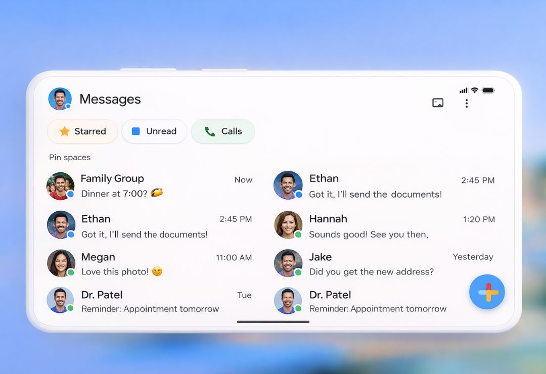
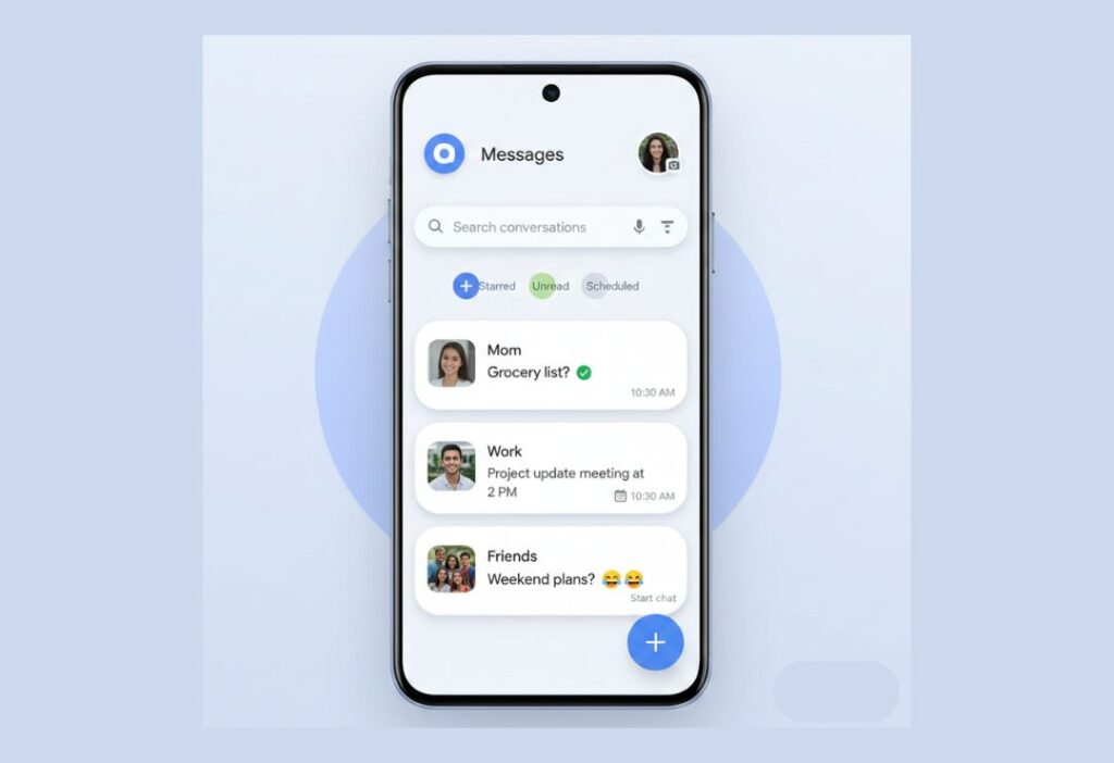
The home screen now places all chat lists inside a big container with curved corners. This creates a cleaner look in both light and dark modes.
Inside chats, message threads sit in their own container. The top bar has quick buttons for calls and menus.
Read receipts appear in clear white circles at the bottom of bubbles. Swipe to see timestamps or reply quickly.
Link previews are taller with bigger images and favicons. YouTube videos support picture-in-picture again.
The plus (+) menu for attachments uses pill-shaped buttons in a grid. Icons for gallery, GIFs, stickers, and more are easy to tap.
How the New Design Improves User Experience
The Google Messages user experience feels much smoother now.
- Improved Readability and Layout: More space between messages and grouped photos make long chats easy to follow.
- Better Accessibility and Usability: Larger buttons, clear icons, and smooth animations help everyone, including those with vision or motor needs.
- Material You Personalization: Colors pull from your wallpaper, creating bright and custom themes that change with your style.
Containers and rounded shapes guide your eyes naturally. Swipes and taps respond quickly with gentle animations.
These small details add up to less frustration and more joy in daily texting.
Key Design and UI Changes in Google Messages
Let’s look at the main visual updates in more detail.
- Chat Bubbles and Spacing: Bubbles have soft curves and better gaps. Read indicators stand out without crowding.
- Color Themes and Animations: Material 3 Expressive brings bold, matching colors. Buttons fill with color when tapped, and menus slide in smoothly.
- Navigation Improvements: Search grids are bigger for easy tapping. Profile and settings menus use cards and pills for quick access.
The camera viewfinder is smaller with rounded bottoms, showing more gallery previews.
Media quality options let you choose original or optimized sending.
In groups, @mentions highlight names clearly.
All these tweaks make the Android Messages app update feel fresh and fast.
Benefits of the Google Messages App Design Update
This update offers clear advantages for users.
Chats stay safer with better privacy tools, like quick ways to leave unwanted groups.
Personal colors and layouts make the app feel unique to you.
Sharing photos and videos is quicker and more immersive.
The design works well on phones, tablets, and even Wear OS watches.
It helps RCS grow by making the app more appealing than older SMS views.
Overall, texting becomes more secure, personal, and enjoyable.
Real-World User Feedback and Early Reactions
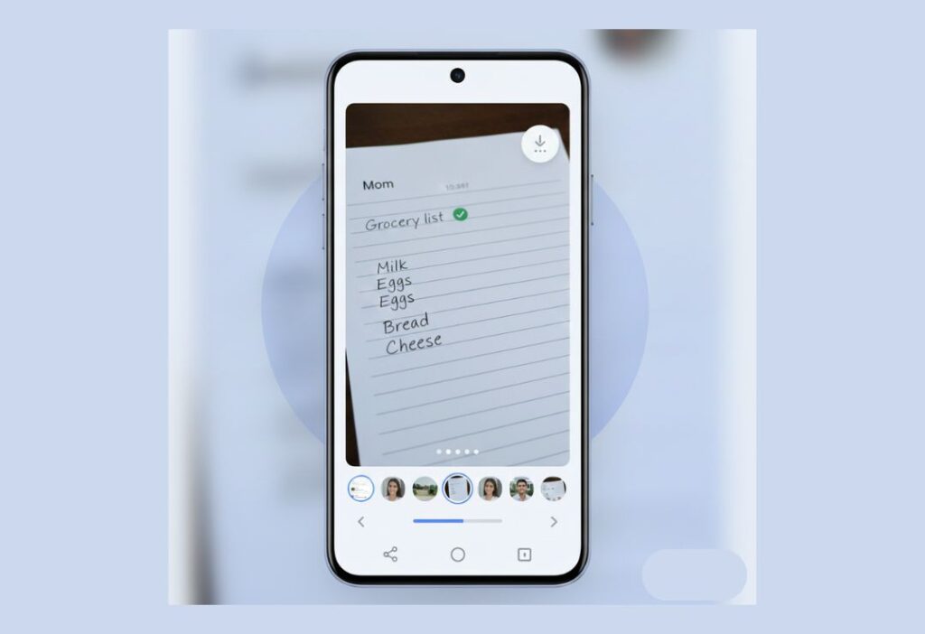
Users love the new photo viewer. Many say swiping between pictures feels natural and fun.
The brighter colors and personal themes get lots of praise for making the app lively.
Grouped photos clean up busy chats, especially in family or friend groups.
Some appreciate smaller AI buttons that stay out of the way.
People on Samsung phones often saw changes first and shared positive screenshots.
A few users miss older layouts at first, but most adjust quickly and prefer the new style.
Feedback shows the update makes daily messaging more pleasant.
Challenges, Limitations, and User Concerns
The update is not perfect for everyone.
Rollouts happen slowly, so some users wait longer than others.
Certain tools, like advanced AI, work only in English right now.
Frequent small changes can feel confusing for some.
Spam sorting could still improve, even with new reporting options.
On older phones, animations might slow things down a bit.
Comparisons to other apps highlight missing features, like better message categories.
Google listens to feedback and plans fixes in future updates.
Future of Google Messages App Design Updates
Google will keep improving the app in 2026 and beyond.
More AI tools for smart replies and photo edits may arrive.
Cross-platform RCS with full privacy will grow stronger.
Deeper personal options, like custom icons or haptics, could come.
Better spam filters and chat organization are likely.
The design will evolve with new Android versions, staying fresh and helpful.
FAQs About Google Messages App Design Update
What are the main parts of the Google Messages redesign?
Rounded containers, fullscreen photo viewer with blur, pill buttons, and personal Material You colors.
How does the Google Messages UI update help everyday texting?
It adds space, quick swipes, clear icons, and smooth movements for faster and easier chats.
What does Material You do in Google Messages?
It changes app colors to match your phone wallpaper, giving a custom and bright look.
Does the update make chats safer?
Yes, with stronger privacy, quick group leaving, and better scam tools.
How do I get the new Google Messages user experience?
Update the app in the Google Play Store. Some changes arrive automatically over time.
Conclusion
The Google Messages App Design Update turns a simple texting app into something modern and personal. With Material 3 Expressive, better photo handling, and thoughtful touches, it improves how we connect every day. These changes show Google’s focus on ease and joy in messaging. Update your app and enjoy the fresh feel – more good things are coming soon.


Why did the delivered and read checkmarks ✔ change. It was very understandable before. White checkmarks turn blue when the message is read. It now shows blue checkmarks in the body of the text when I send a message. At some point the circle with the checkmark turns white. Not sure if that means it’s read. Also you have to move the text over to see the time of the message. Unnecessary changes. Worked better before this change.
You’re right — the old system was much clearer. The update changed the design to look modern, but it made read/delivered status confusing and hid the message time. Many users feel it worked better before and these changes were unnecessary.